
Johns Hopkins Credit Union
JHCU Rebrand


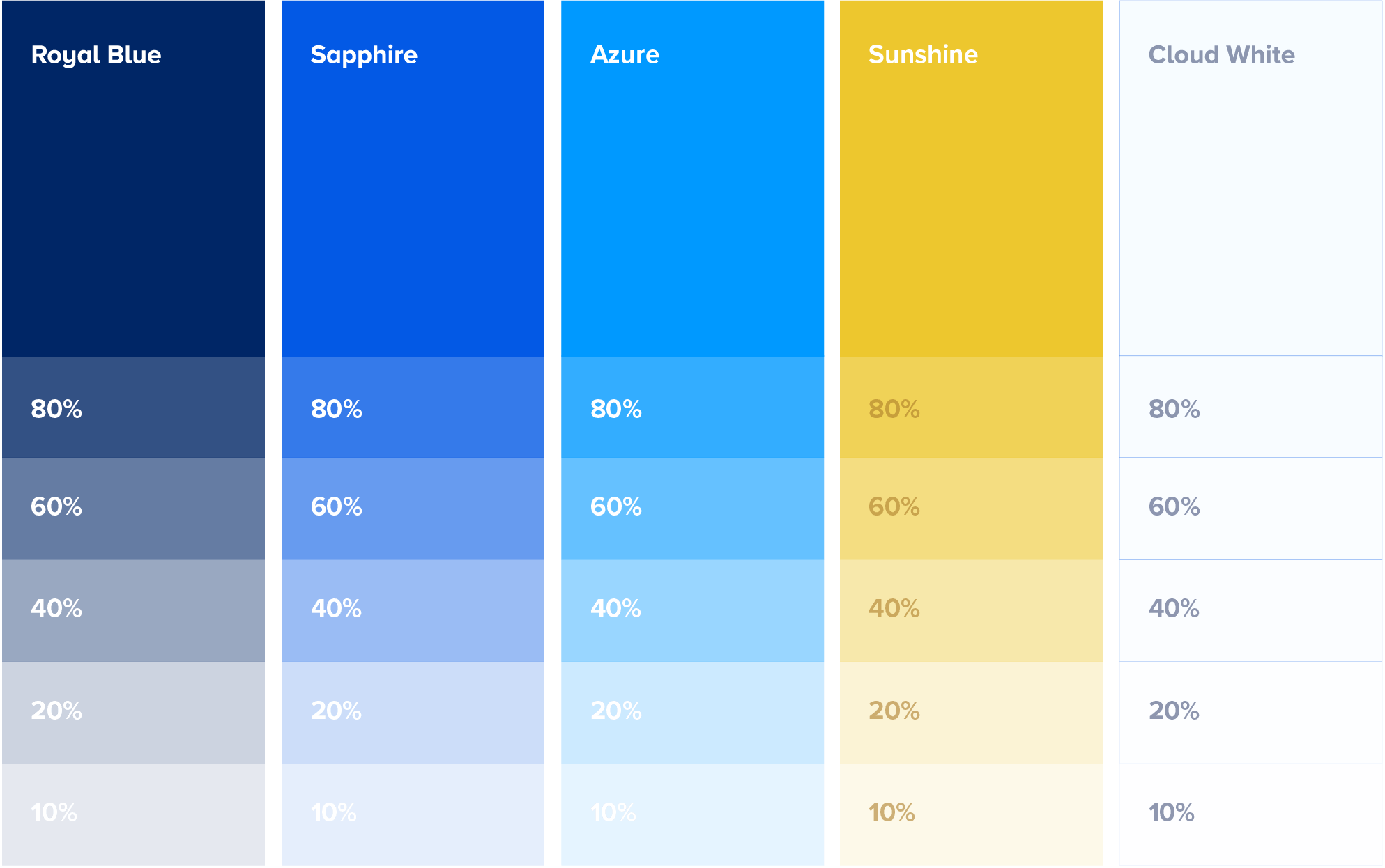
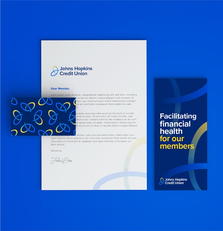
Johns Hopkins Credit Union serves employees across Johns Hopkins University, the Johns Hopkins Health System, and affiliated organizations. In a landscape crowded with Johns Hopkins-branded entities, the credit union struggled to stand apart and communicate its unique value to prospective members. We were challenged with creating a brand that felt relevant and personal to a diverse audience while reinforcing what makes the credit union different.
BEFORE
AFTER


Ready to get started?
Let's talk!
Ready to get started?
Let's talk!
Ready to get started?
Let's talk!
Ready to get started?
Let's talk!
Ready to get started?
Let's talk!
Ready to get started?
Let's talk!
Ready to get started?
Let's talk!
Ready to get started?
Let's talk!
Ready to get started?
Let's talk!
Contact US